Office Colors in Interior Design
Colors are not merely decorative elements but also play a crucial role in shaping the ambiance and emotions of a workplace environment. In office interior design, choosing and combining the right colors not only enhances aesthetic appeal but also directly impacts employees’ moods, productivity, and creativity. Each color carries its unique meaning and symbolism. In this article, TECO invites you to explore the significance of various colors and the key considerations when selecting office colors for interior design.
The Significance of Colors in Office Interior Design
Colors in office design serve a dual purpose: enhancing aesthetics and improving work efficiency and psychological well-being. Let’s delve into the commonly used color palettes in office spaces with TECO.
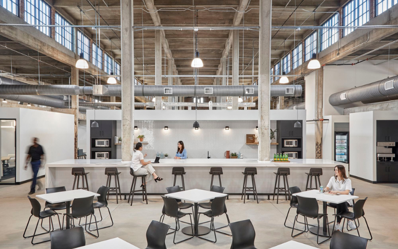
White Palette
White symbolizes minimalism and sophistication, effectively reflecting light and creating a bright, spacious office environment. It is often used in offices with limited space, open layouts, and modern design trends. As a neutral color, white minimizes distractions, helping employees stay focused. Its versatility allows easy integration with other colors, creating diverse design styles. However, it’s essential to pair white with natural elements like wood or greenery to avoid a monotonous or cold atmosphere.
White represents minimalist, sophisticated beauty.
Black Palette
Black represents elegance, luxury, sophistication, and authority. It is associated with modern, minimalist styles and is used to create bold, distinctive spaces. Black is also effective for adding contrast and emphasis. Combining it with other colors like white, yellow, or light gray can bring balance and depth to the space. However, overuse of black can make the office appear dark or overwhelming, so it should be applied sparingly.
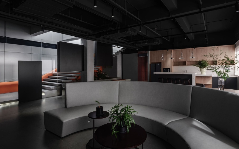
Black represents elegance, luxury, sophistication, and authority.
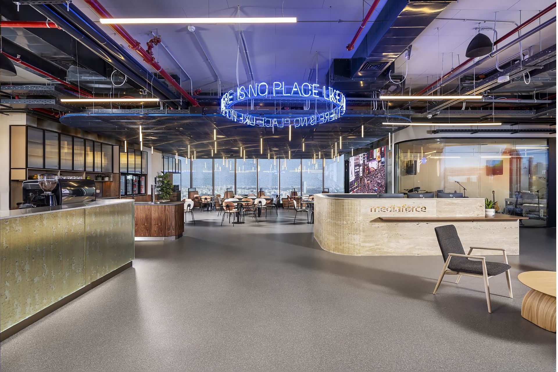
Red Palette
Red symbolizes passion, energy, and dynamism. As a vibrant and bold color, red is often used to create focal points in interiors. In offices, red can boost energy levels, stimulate creativity, and motivate employees.
For industries like media, creativity, or sectors requiring constant innovation, red exudes intensity and enthusiasm, making it an ideal choice. However, red should be used as an accent rather than a dominant color, as excessive use can cause tension or a sense of confinement.
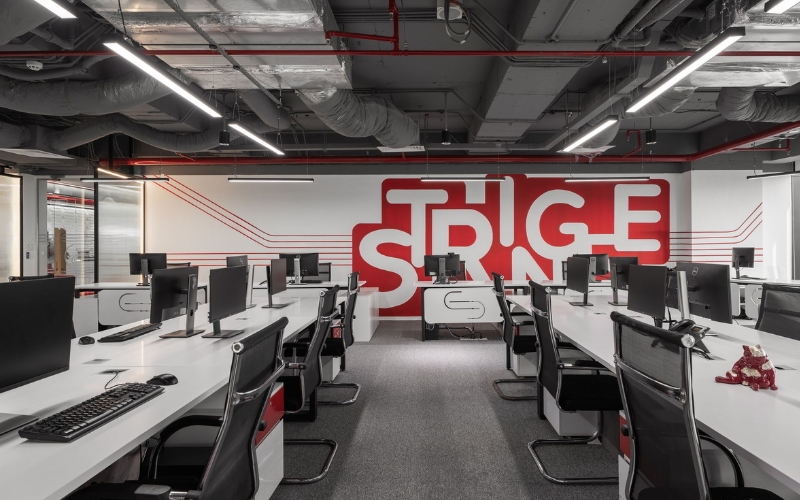
Red represents enthusiasm, passion, fire, energy.
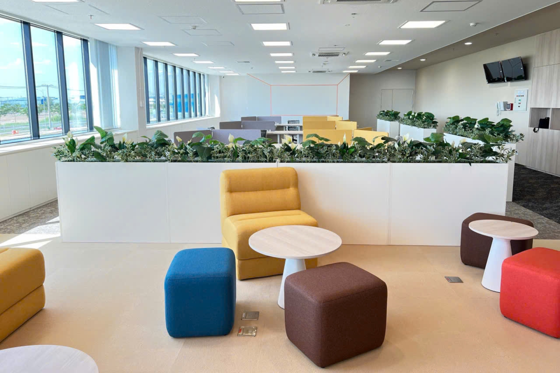
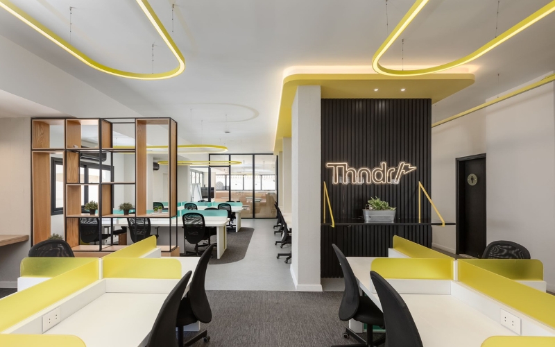
Yellow Palette
Yellow is frequently used in interior design for its optimism and positivity. Associated with sunlight, freshness, and vibrant energy, yellow inspires creativity, stimulates thinking, and fosters a cheerful, optimistic atmosphere for employees.
In feng shui, yellow represents wealth, luck, and prosperity. Integrating yellow into office design can convey a message of growth and success for the business.
Red represents enthusiasm, passion, fire, energy.
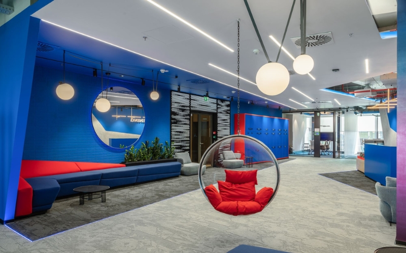
Blue Palette
Blue signifies professionalism and trustworthiness, making it a prominent choice in industries like technology, finance, and law. It exudes calmness, relaxation, and a sense of serenity, which is why blue is often used in areas requiring high concentration or stress management.
Depending on the company’s direction, blue tones can vary:
- Light blue: Evokes tranquility and comfort.
- Dark blue: Conveys strength, sophistication, and professionalism
Red represents enthusiasm, passion, fire, energy.
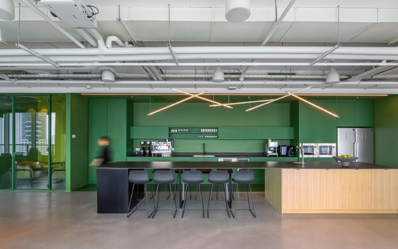
Green Palette
Green evokes nature, plants, and environmental friendliness, making it suitable for businesses aiming to establish a sustainable and approachable image.
Green is also associated with life, renewal, and growth, making it an excellent choice for companies in technology or healthcare. Similar to blue, green offers a sense of peace and relaxation. It helps reduce stress and creates a calming atmosphere, enhancing employees’ mental health and work performance.
Red represents enthusiasm, passion, fire, energy.
Key Considerations When Selecting Colors for Office Interiors
Incorporating Brand Colors
Integrating brand colors into office design enhances brand recognition. These colors reflect the company’s values and messages, turning the office into a visual representation of its mission, culture, and vision. Beyond recognition, brand colors foster a sense of pride and unity among employees, encouraging teamwork and collaboration.
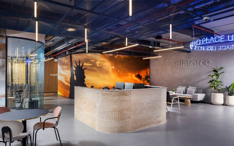
Brand colors need to be harmoniously combined with office colors.
Avoiding Overuse of White
While white promotes simplicity and focus, overuse can lead to monotony and a lack of creativity. It may make the space feel lifeless and unoriginal. Pairing white with vibrant accents can create a more dynamic and balanced environment.
Harmonizing with Lighting
Lighting and color are complementary elements in office design. When selecting colors for walls, ceilings, floors, and furniture, consider the brightness and type of lighting (both natural and artificial). A mismatch between colors and lighting can lead to discomfort and fatigue among employees.
In office design, light and color in the office are factors that go hand in hand.
Paying Attention to Floors and Ceilings
A common mistake is neglecting the design of floors and ceilings in office interiors. These elements are crucial in completing the space and enhancing its functionality and comfort. Proper attention to flooring and ceiling design ensures a cohesive and well-rounded office environment.
Each color carries its unique meaning and symbolism. Understanding these characteristics is essential for selecting the right colors. A well-designed office with harmonious and creative color schemes is the key to fostering an ideal work environment, contributing to the sustainable growth and long-term success of the business. TECO hopes this article has provided valuable insights into office colors for interior design, helping you choose the most suitable and effective palette for your workspace.