Color in Language Center Design: Crafting a Lasting Brand Identity
There are many factors to consider when designing a language center. And color is one of the most critical elements. Color is not merely a decorative factor but also a powerful “visual language” that reinforces brand identity and positions the image in the minds of teachers and students. Choosing the right colors also helps create consistency, credibility, and professionalism for the entire center. In the article below, let’s explore with TECO the role of color in language center design and the principles of harmonious color combinations.
The Importance of Color in Language Center Design
When it comes to a brand, it consists of many components, such as the name, logo, slogan, patterns, and especially the dominant color. Many studies show that people tend to remember images faster than text, and 80% of brand recognition comes from visual elements.
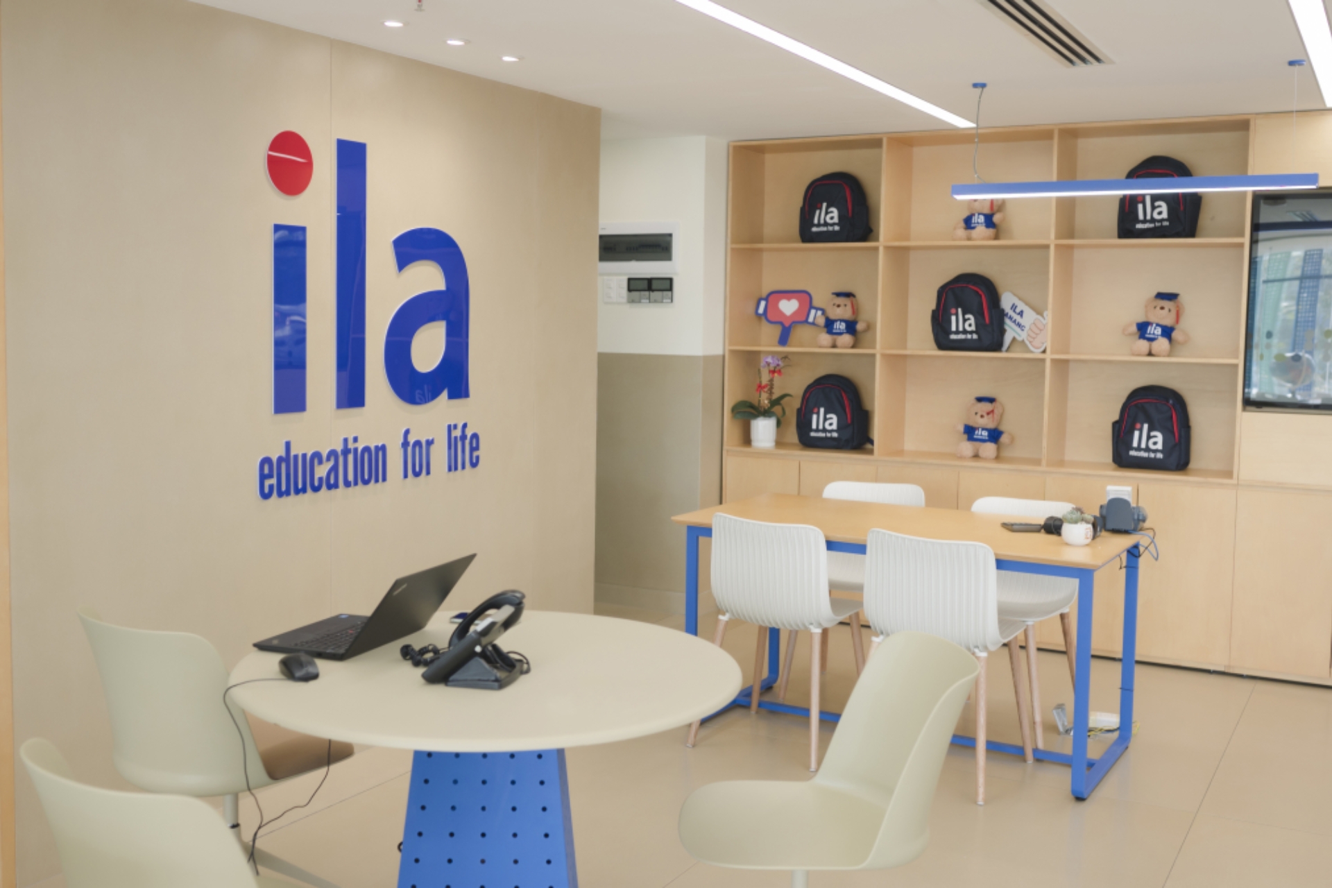
For example, Apollo English uses blue as its primary color, combined with white, alongside the slogan “Where the best become better.” Apollo’s blue conveys approachability, friendliness, and professionalism.

Blue is the primary brand color of Apollo English.
The Meaning of Different Color Groups in Language Center Design
Below is a brief overview of the meanings of different color groups to help you decide when selecting a color scheme for your center.
Warm Colors (Red, Orange, Yellow)
-
Meaning: Inspiration, energy, and enthusiasm.
-
Note: Should be combined with neutral colors to avoid an overly intense or chaotic feel.
Red symbolizes inspiration and enthusiasm.
Cool Colors (Blue, Green, Purple)
-
Meaning: Trust, professionalism, calmness, and intelligence.
-
Note: Choose appropriate shades (pastel or dark) to create a pleasant and not overly somber effect.
Neutral Colors (White, Gray, Beige)
-
Meaning: Modernity, sophistication, and the perfect backdrop to highlight the primary color.
-
Note: Often used as a background or in interior design to emphasize key brand elements.
Understanding the meaning and message of each color group helps the center choose colors that align with its brand positioning, creating a more effective space.
Reference Color Combination Principles for Language Center Design
A language center becomes attractive and visually appealing when colors are balanced and harmonized. TECO provides some color combination principles you can consider for your language center:
The 60-30-10 Rule
This rule is understood as:
-
60% Dominant Color: The primary brand color covers most of the space (this is the brand’s identity color).
-
30% Secondary Color: Complements the main color, adding diversity and depth to the design.
-
10% Accent Color: Used to attract attention and create focal points in the space.
The space will become balanced, harmonious, and comfortable if you apply this 60-30-10 rule.
Consistency and Synchronization Between Design and Brand
A key consideration when designing an English center’s interior is ensuring consistency in brand identity. This means colors should be uniformly applied across the interior space, signage, uniforms, website, and marketing materials. Avoid using too many contrasting colors, which can create visual clutter and deviate from the brand identity. Consistency is the key to positioning the brand in customers’ minds and building a strong brand.
Consistency and synchronization between design and brand.
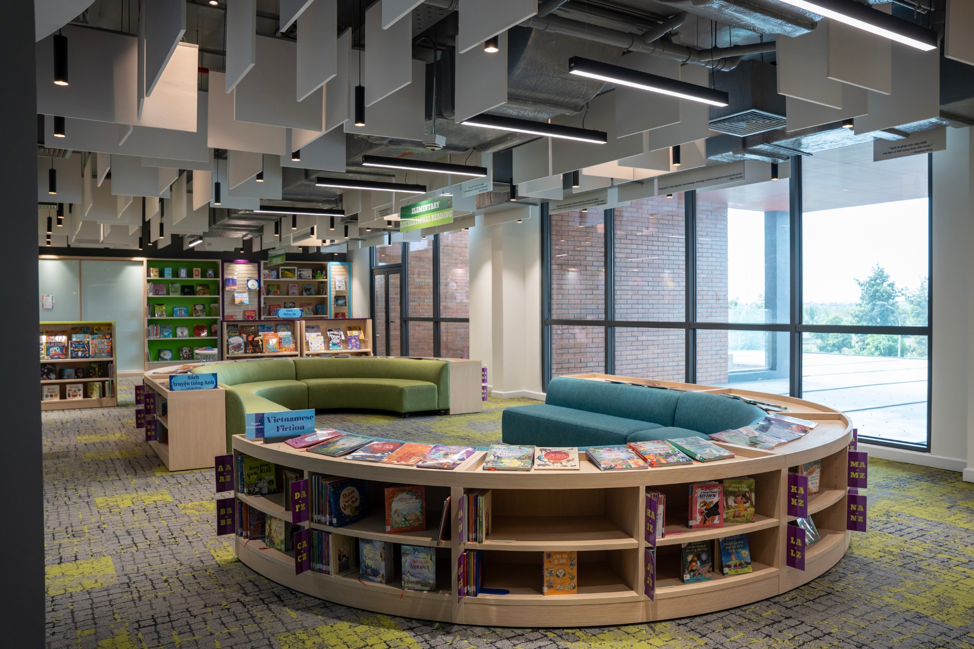
Considering Lighting and Materials
Natural and artificial lighting directly affects how people perceive colors. Lighting should be arranged harmoniously in the space to avoid glare. Additionally, materials like wood, metal, and glass can alter color reflection and shades. Therefore, when designing, test color combinations under different lighting and spatial conditions.

Pay attention to lighting and material factors.
Choosing Suitable Colors for Each Space
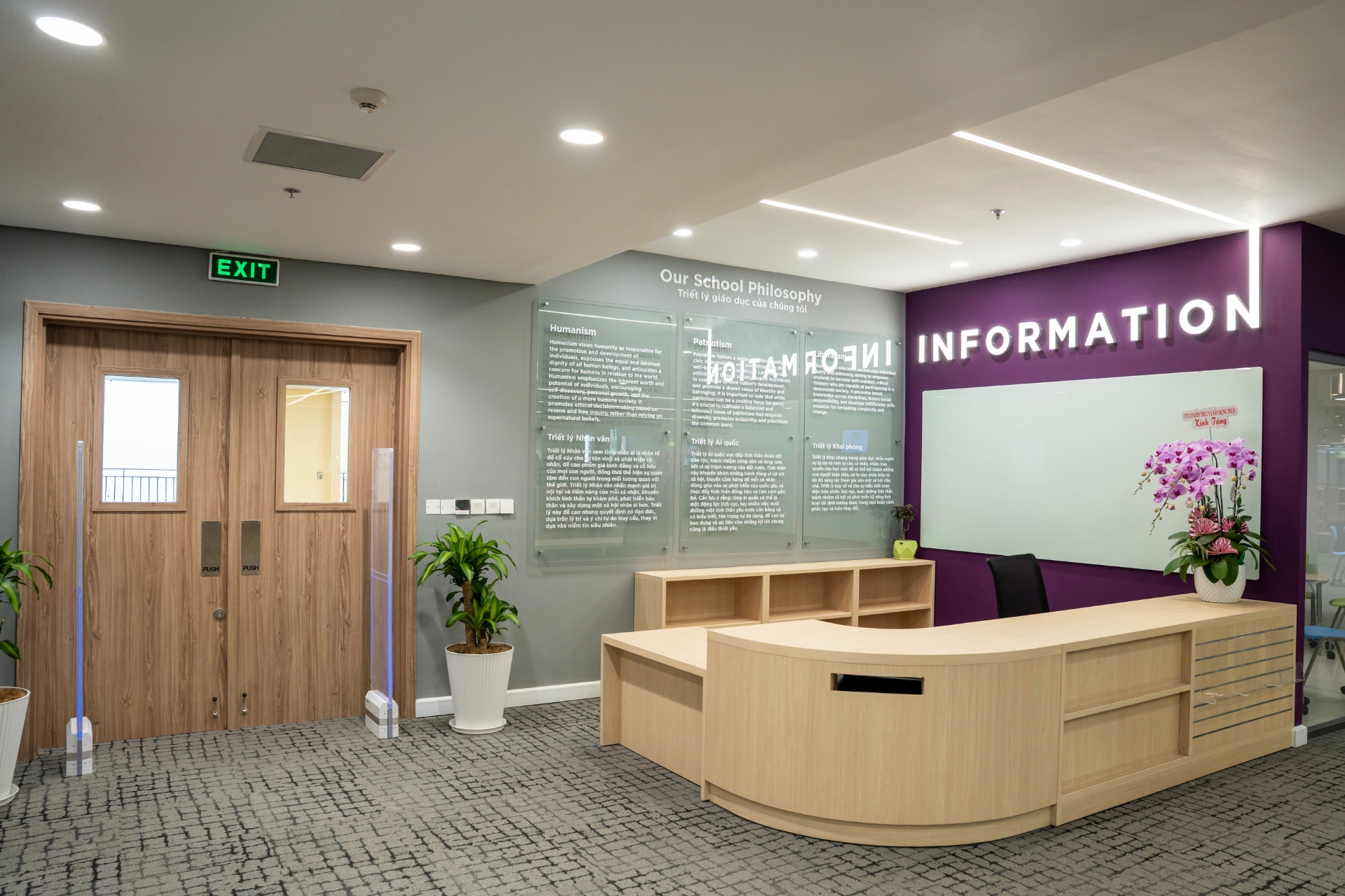
The size of the space is also an important factor influencing color selection in language center design. For small spaces, prioritize light tones like white, cream, or pastel blue to create an open, airy, and comfortable feel. Light colors reflect light well, enhancing visual spaciousness and reducing a cramped sensation. Conversely, in larger spaces, deeper shades like navy blue, dark gray, or deep red can add depth, create focal points, and evoke coziness. Colors can also help clearly define functional zones and improve spatial orientation.
Thus, harmonizing space size with an appropriate color palette will contribute to a language center that is both aesthetically pleasing and learner-friendly.

Choosing suitable colors for each space.
Conclusion
Selecting and combining colors not only enhances the visual appeal of a language center design but also establishes a clear brand identity, improving learning experiences and memorability for students.
If you plan to build a professional language center, start by developing a clear brand identity, where color serves as the “emotional bridge” between the brand and its customers.
Note: Collaborate with a professional design firm experienced in the education sector to receive expert advice on suitable color schemes and ensure practical application during construction. TECO proudly serves as the design and construction partner for many leading English centers in Vietnam, providing businesses with tailored solutions that align with their brand strategy and identity. Contact TECO today for a free consultation on your English center’s space.